|
 |
|
Sparkster logo - I
painted this logo per a request I received here at
CAL Designs. Sparkster runs a multi-purpose website
dedicated to NASCAR Racing 2003 Season. As you can
see, I ran with the spark concept and was really
happy with the final product. I haven't drawn enough
sparks and lightning to really feel comfortable with
it, but though this one got the point across well
enough. |
|
|
|
|
Team LightSpeed
banners - You might catch a glimpse of these banners
as part of Sport Planet's banner rotation program.
I've grabbed the car shots with the Car Viewer
program and tried to highlight the outstanding paint
schemes run by various members of Team LightSpeed. |
 |
 |
|
| Dark
Side Racing - This custom logo was completed by
request for the Dark Side Racing team. The team
wanted a logo that reflected both their name and
namesake, Pink Floyd's Dark Side of the Moon. I
threw the album onto the CD tray to get in the mood
and this is what emerged. |
 |
|
 |
OFS logo -
Although by our standards this is a pretty straight
forward and simple logo, how it came about is
interesting in my opinion. My wife, Donna, works for
a trucking firm in Oklahoma City and her boss needed
a company logo. He'd hired an artist to create logos
for his other companies, paid through the nose, and
really wasn't happy with what he got in return.
Donna convinced him that I could produce him a logo
that he would be happy with and this is the result.
This logo is now
on the company's letterhead, coffee cups, and on the
side of the trucks. So if you see if traveling down
the road. You'll know who designed it.
|
|
|
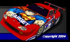
Team LightSpeed
forum logo - I really love using the Car Viewer
program to take interesting shots for logos and have
used it here. Again with Paint Shop Pro's cool
motion trail filter. Chris Rosado (#61) and Brian
Simpson's (#34) paint schemes are beautiful and lend
themselves well as Team LightSpeed's logo.
|
 |
|
 |
|
LightSpeed Team Challenge - Did a whole lot of
work on this series, designing the main banner and
all the page headers, but the series never got off
the ground. I really loved this series of
banners and this page header logo is a good example of some
techniques I learned creating them. The car in the foreground has been pulled
off the in game screenshot and I applied a pastel filter
to the screenshot. Then I placed the image I'd
pulled back onto the shot. I thought it really made for a cool looking
logo and showcased the paint schemes I'd created for
the series. The logo to the right of the header is
the main banner and was going to be on the Team
Challenge webpage
and the hoods of all the IROC style cars we'd
planned on using. Still really like to see Team
LightSpeed get another racing series off the ground.
|
|
 |
Pardon the light
blue outline around this logo. I went and lost the
original layered version, but I can't part with the
logo. I've done dozens if not hundreds of logos for
the pages of Team LightSpeed, but this has always
been my favorite - by a longshot. And the sad thing
is that I didn't even take the screenshot I created
the logo from. The folks over at Papyrus did. This
logo was posted over at LightSpeed on the track and
driving guides pages. It was my first try at using
the pastel filter and I thought the Cherrios' car
just popped off it. |
|
 |
|
This in an early
banner I created for Team LightSpeed's NASCAR Racing
4 setups page. It marks one of the first tries at
pulling images off the screenshot for effect. It's
also from what I jokingly consider my "blue" period,
where I colorized my headers in blue to match the
theme of Team LightSpeed's pages. But I really liked
pulling the images off the screenshots and still use
the technique today. I'm hoping to share the
procedure used to do it with you on the Tools and
Tips page.
|
|


